Use logic to overcome subjective opinions. Create a color palette that is accessible, predictable, and showcases consistent visual weight.
Design system | Accessibility
Product
Volcano engine design system
Skills
Design system - Color palette
Timeline
Q3 2023
Collaborators
HongLiu
The problem
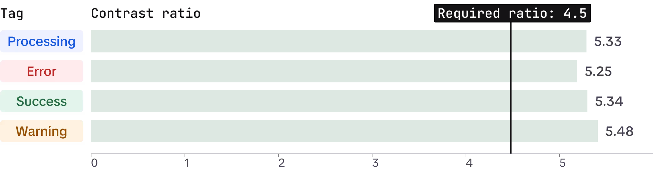
The current color palette has a noticeable contrast issue, especially with the yellow color.
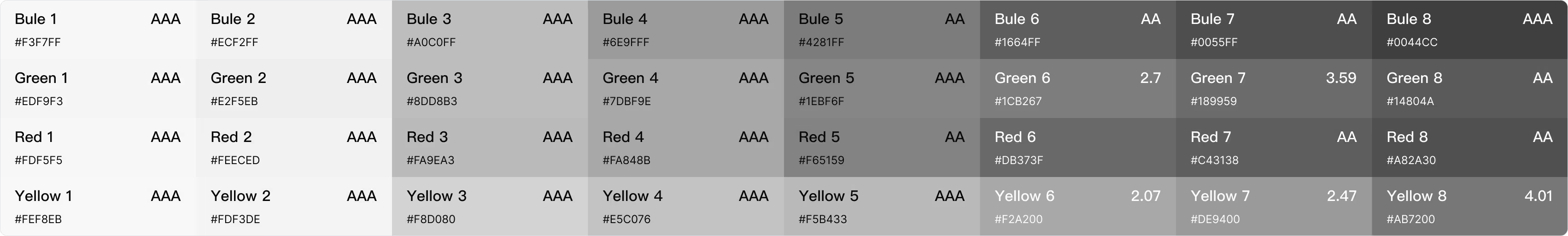
Current color palette
Contrast level below WCAG requirement.
Colors at the same level vary greatly in visual weight.
The challenge
Attempt #1
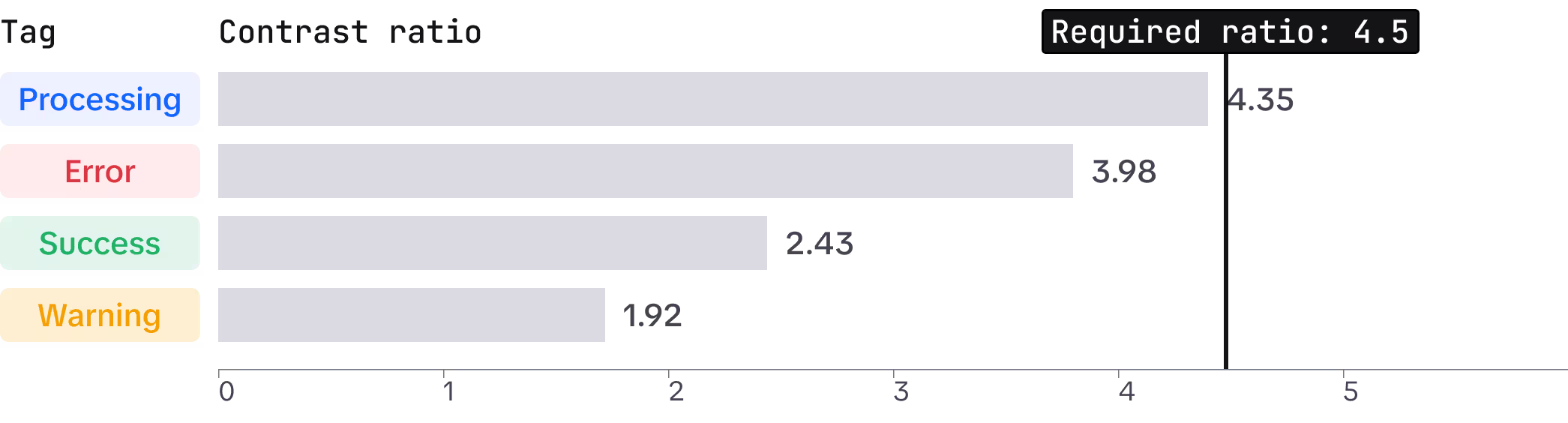
The issue is both clear and quantifiable. At first, I thought that darkening yellow and green to increase contrast would resolve the problem.
The attempt was unsuccessful.
The majority of my fellow designers still prefer a lighter shade of yellow and green.
Poll result
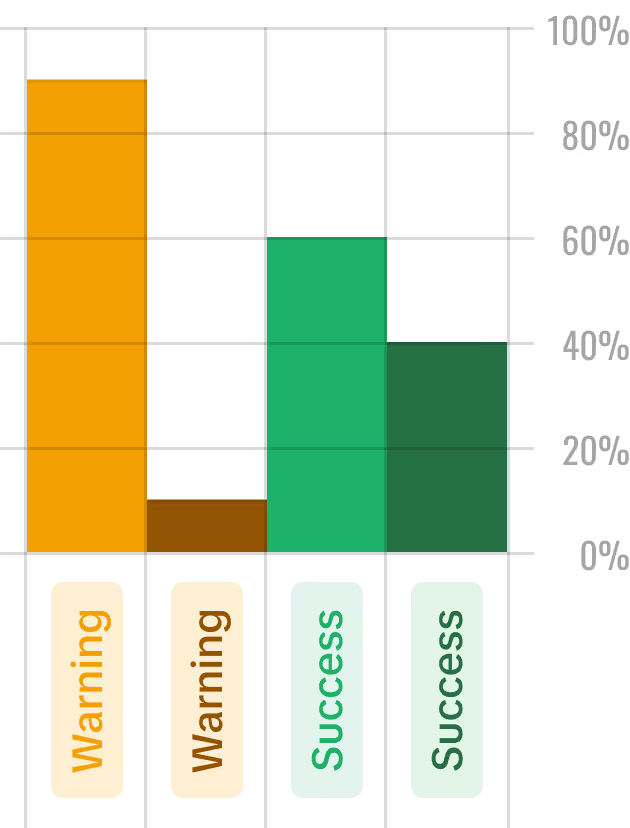
Warning
"This is not yellow; it is brown and feels dirty."
Success
"Green often indicates success and excitement, but this shade of green feels too dark to evoke any excitement."
What are they really worrying about?
Subjectivity
Randomness
Attempt #2
Keep the same lightness value, find clear and logical patterns to follow.
🤔️
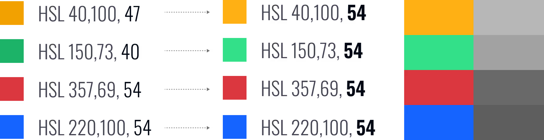
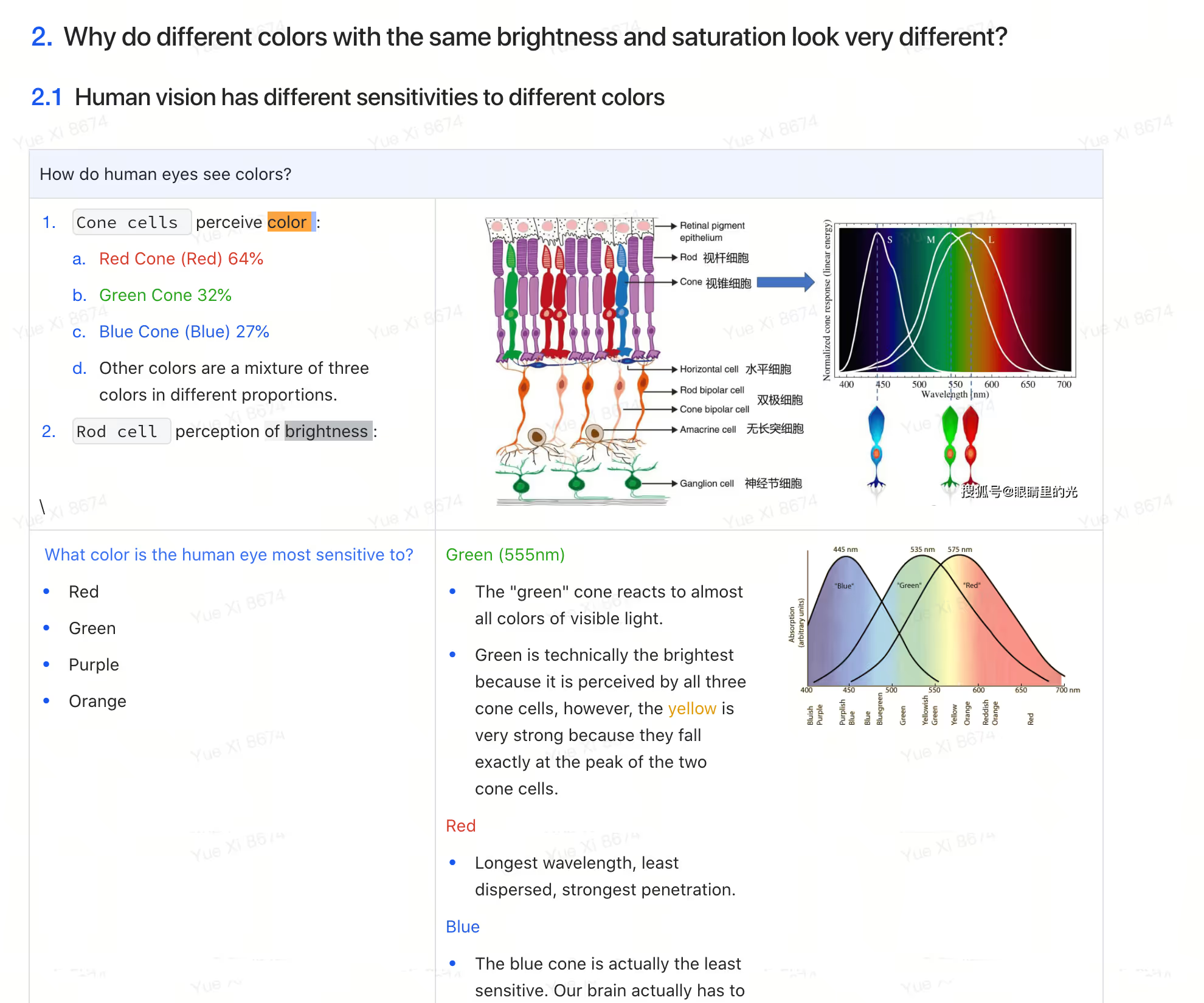
Why does the same lightness value lead to a very different brightness? Yellow and green appear much brighter than red and blue.
What are they really worrying about?
Accessible
Predictable & Logical
Consistent visual weight
At the same level, different color are perceived as having similar levels of heaviness or lightness in a design.
Understanding color
I've embarked on my color research journey. Color is an astonishing science. Navigating through extensive knowledge is challenging. I began by seeking the answer to why different colors at the same level have diverse visual weights and ended up learning a great deal more.
Q1
Q2
Q3
Q4
Why do different colors with the same brightness look very different?
Human vision has different sensitivities to different colors.
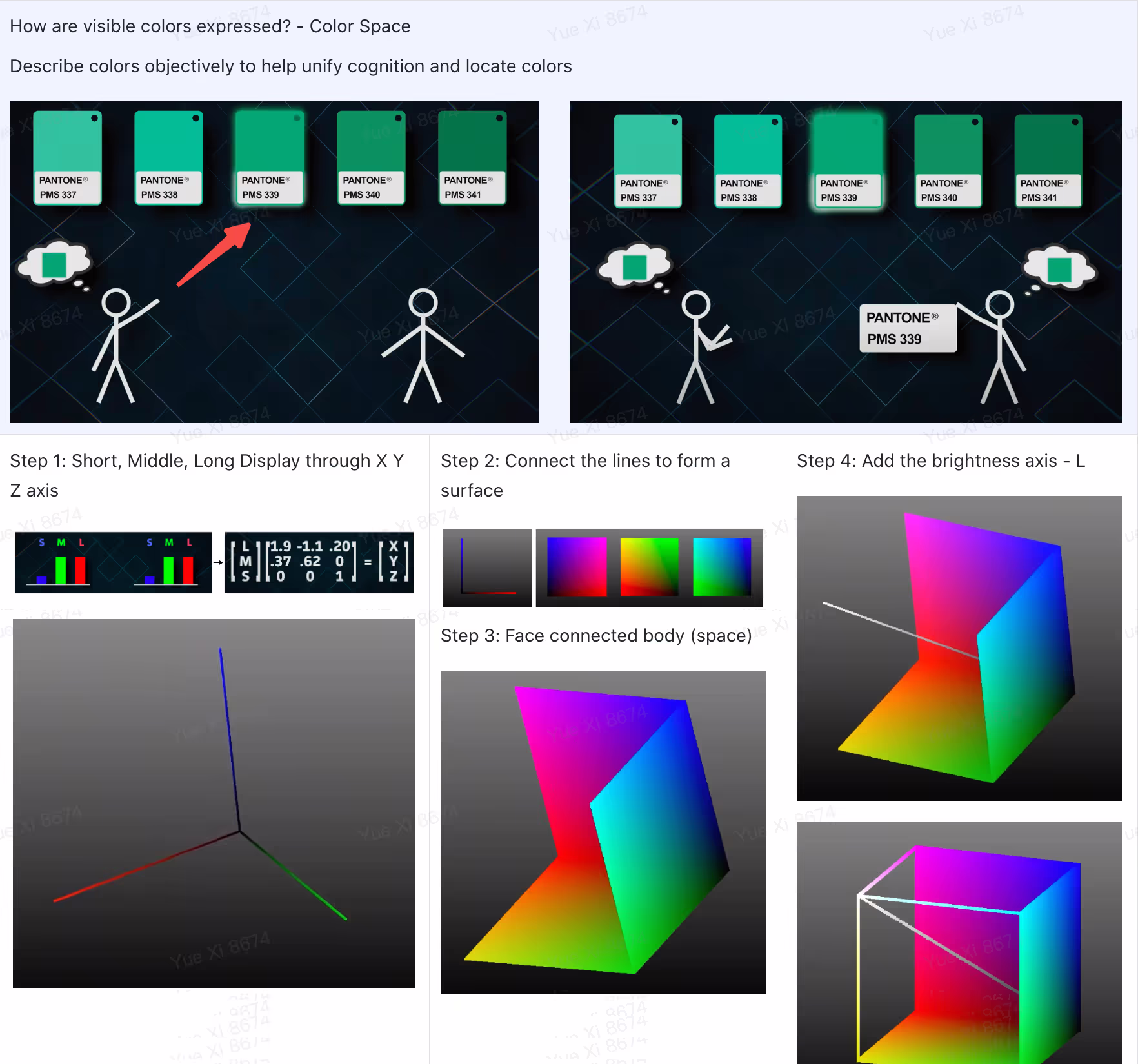
What is color space?
Describe colors objectively to help locate colors.
What are the problems with RGB color space?
Color is displayed based on computer technology not human eye. Distribution is not uniform.
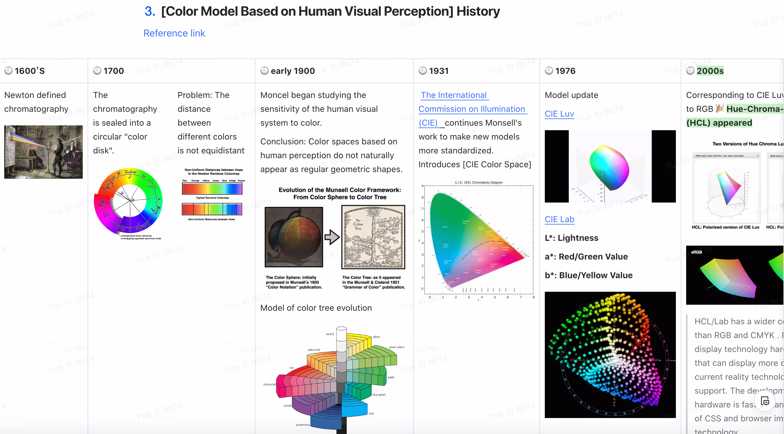
How the visually uniform color space emerged?
Long long stroy.
Choose the right color space
Perceptually uniformed color space.
Choose the right tool for color selection.
Tool grounded in perceptually uniform color spaces.
Decompose color variation into individual elements.
Break down into changes in hue, saturation, and lightness

Color knowledge sharing
By sharing color theories to provide context and enhance credibility.
Visualize problems
Clearly articulate the problem to bring everyone onto the same page.
Use tool to assist color selection
Use tools to reduce randomness and increase credibility.
Show result
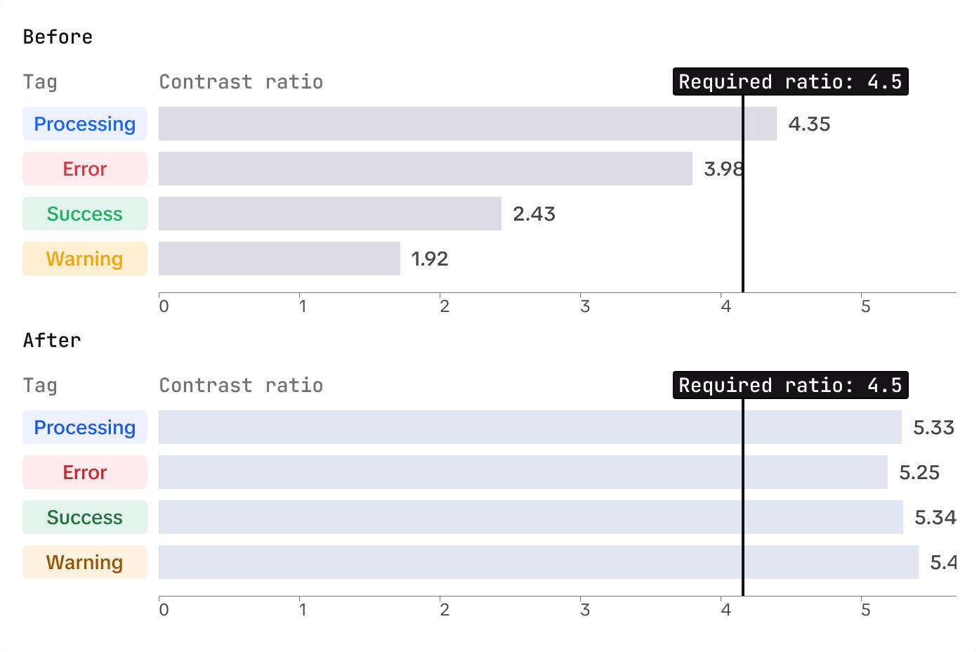
Compare before vs after, demonstrate the optimization effect
01
02
03
04
Some metrics
3
Sessions
+150
Participants, 50% of department designers

Visualize problems
ATMOS use LCH and OKLCH color space to create palettes that are predictable, perceptually uniform, and have the right color contrast.
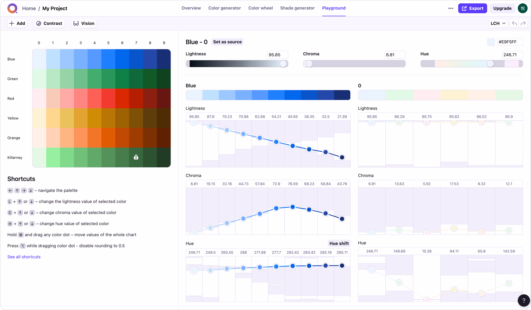
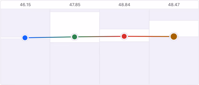
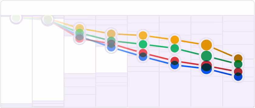
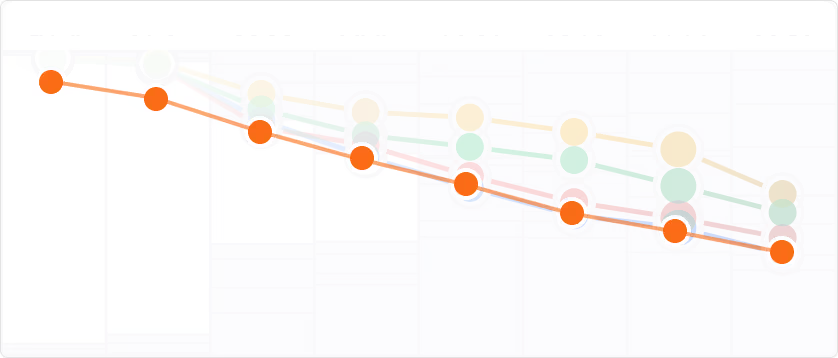
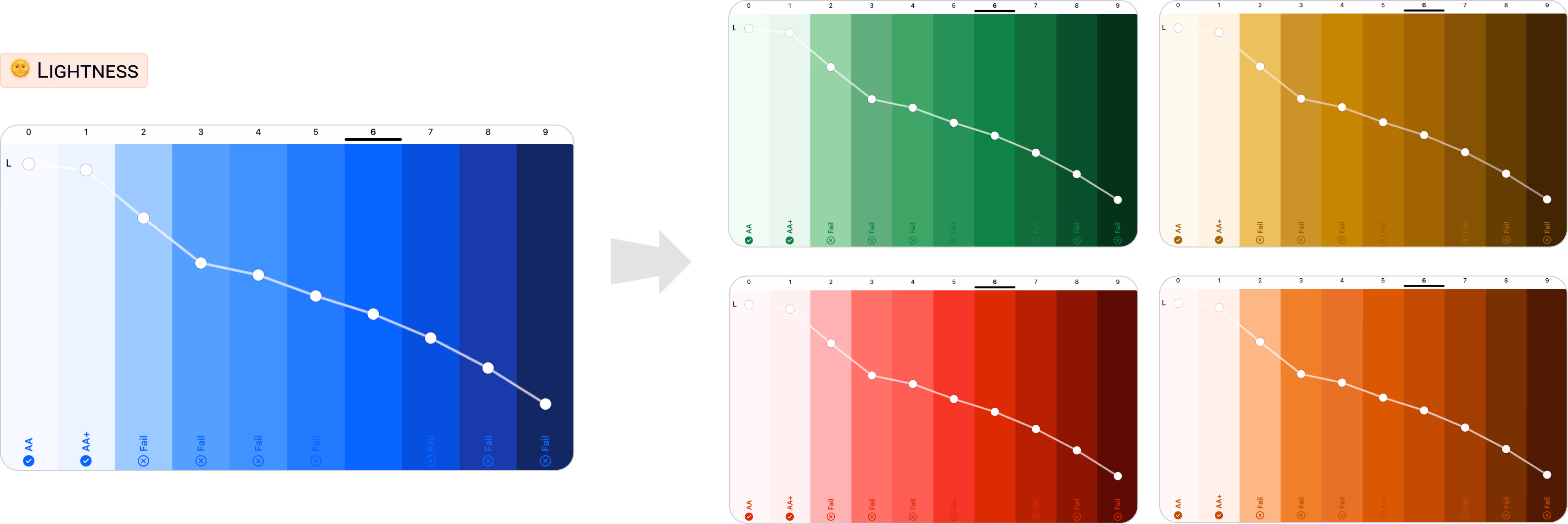
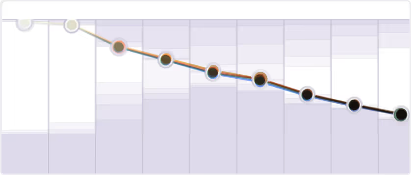
Different colors ALL LEVEL lightness curves
Current state
Ideal state
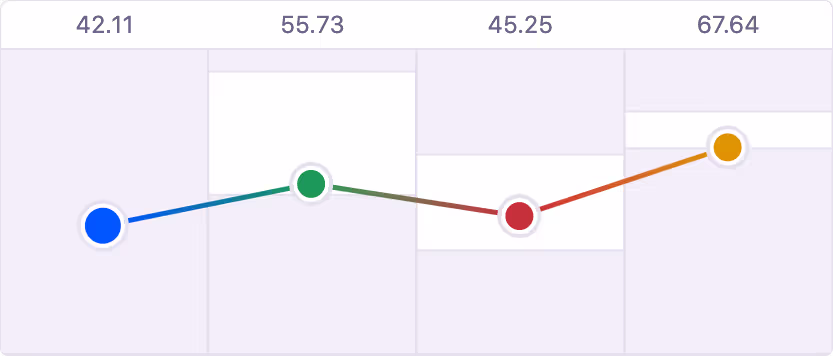
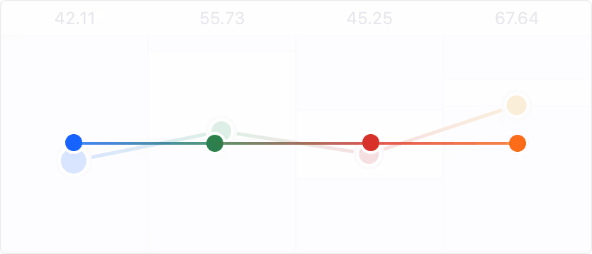
Different colors PRIMARY LEVEL lightness curves
Current state
Ideal state
Solution
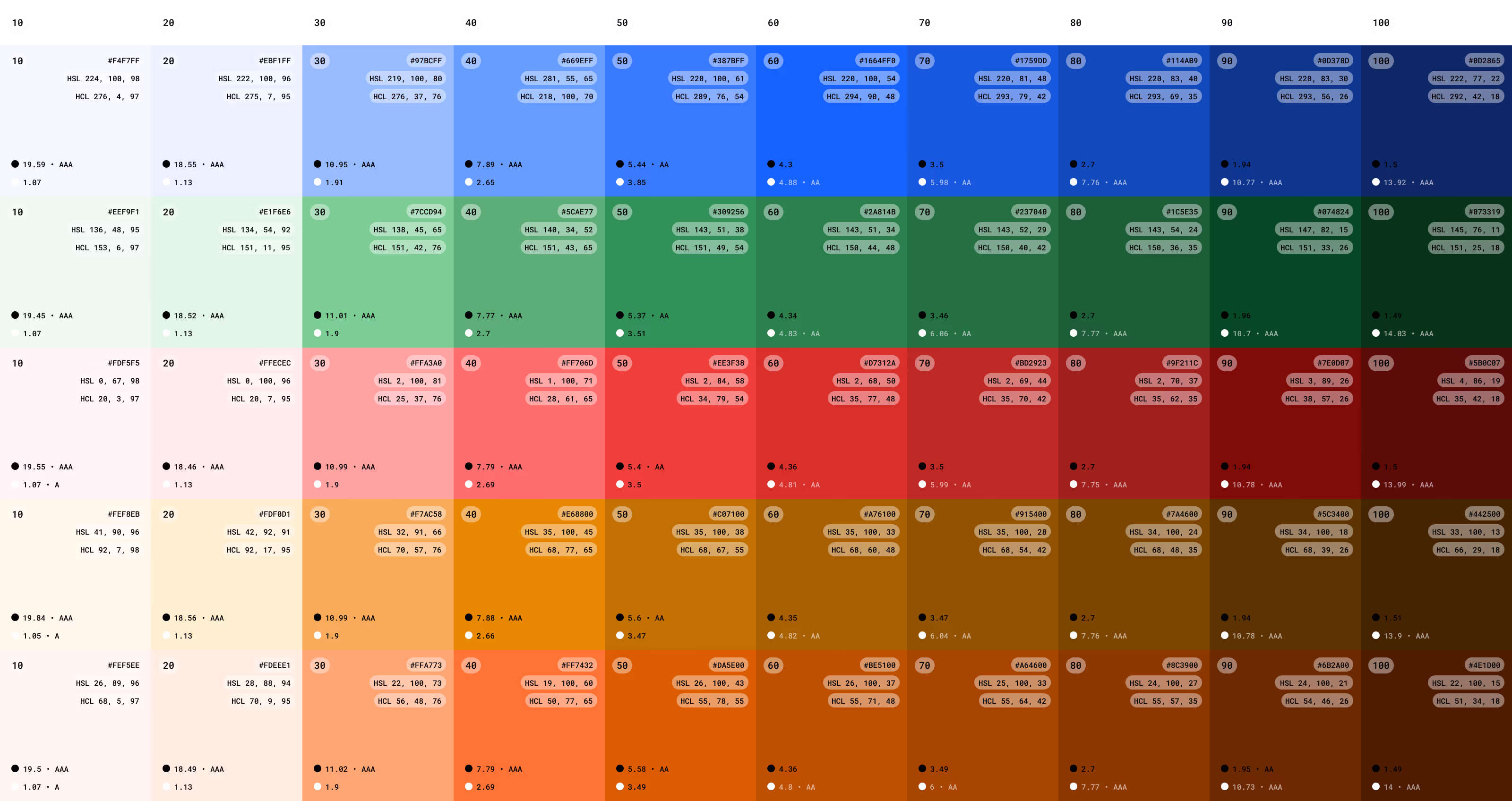
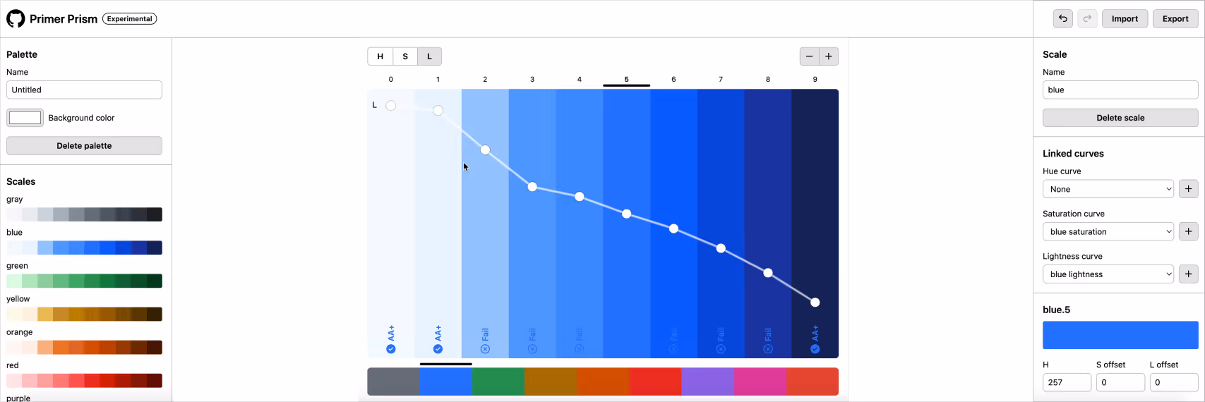
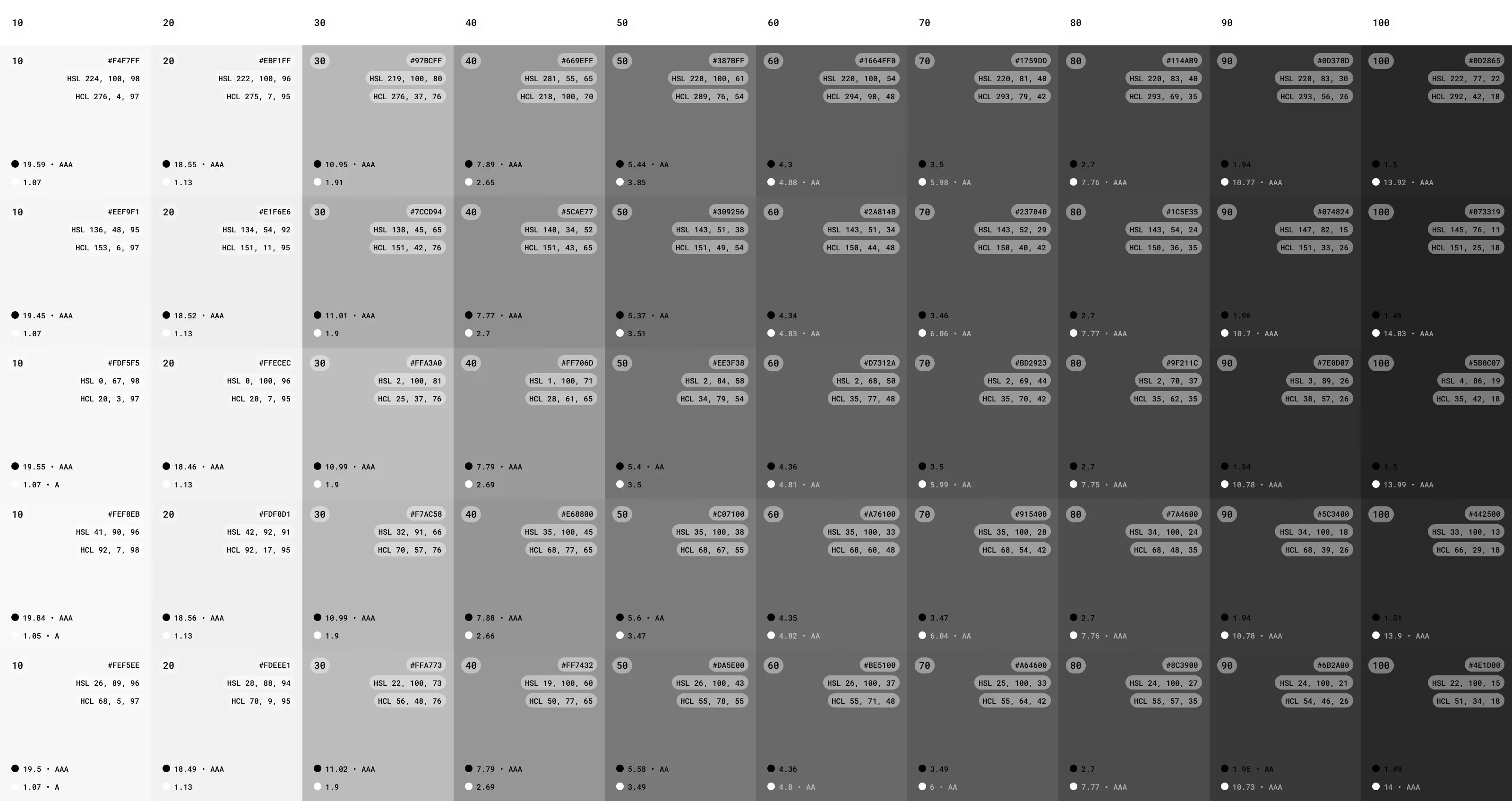
Primer Prism is an open source tool for creating and maintaining cohesive, consistent, and accessible color palettes. Primer Prism uses the HSLuv color space.
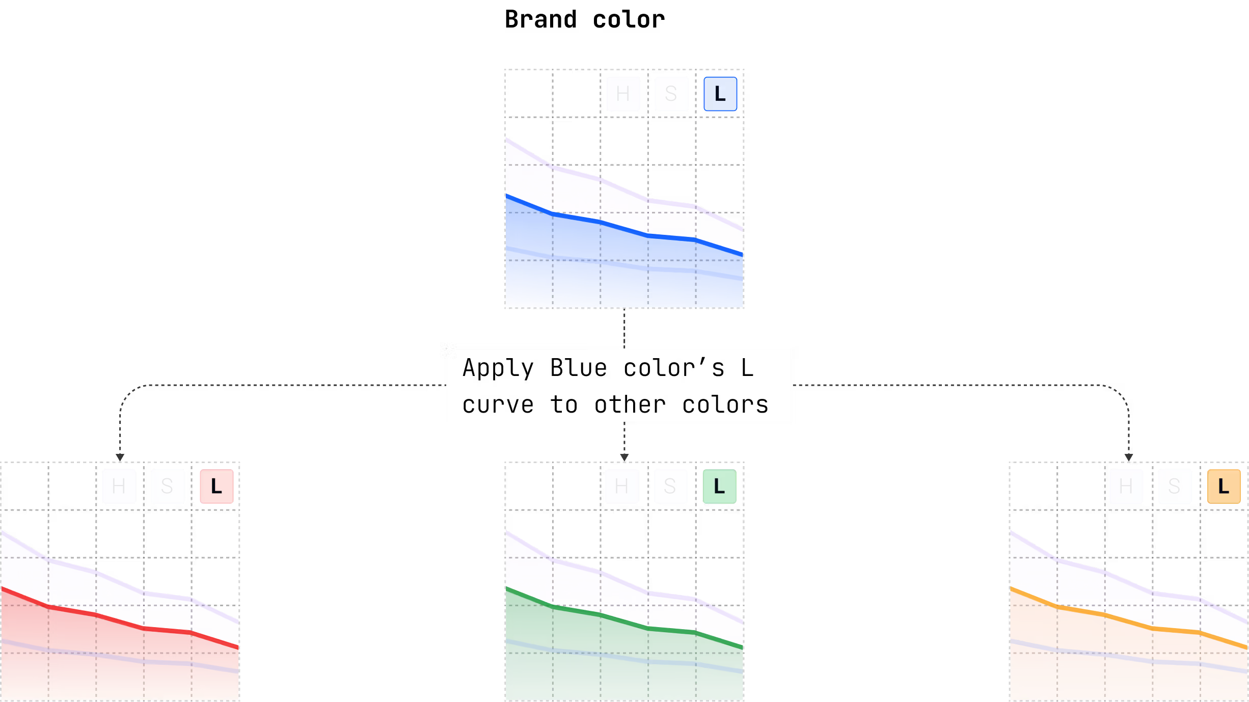
Set up brand color's lightness curve
Apply blue lightness curve to other colors
Solution
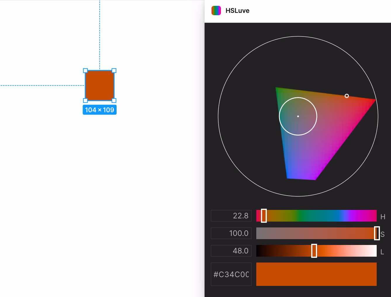
HSLuve is perceptually uniform color spaces, when do color fin tuning, kept the same L vaule.
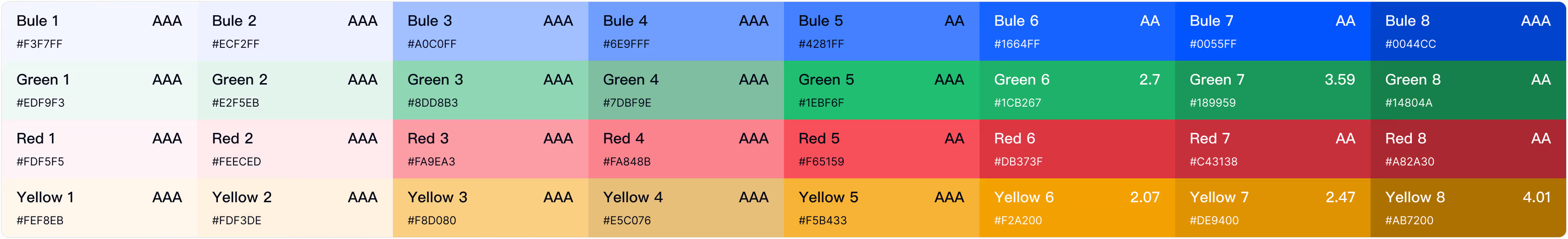
Final color palette
Show changes
Before
✅ After
Before
✅ After
Different colors ALL LEVEL lightness curves
Before
✅ After
Different colors PRIMARY LEVEL lightness curves
Before
✅ After